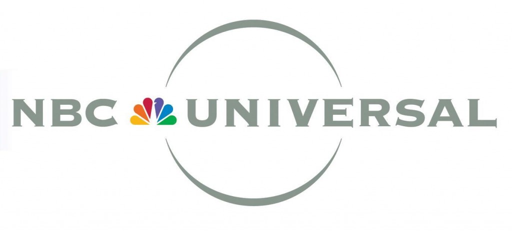
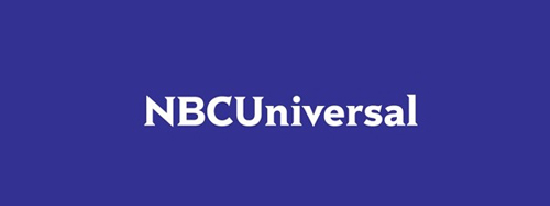
After being acquired by Comcast, NBCUniversal recently unveiled a new corporate logo, removing (1) the space between the words in its name, (2) the “globe” symbol, and (3) its incredibly iconic peacock.


It’s utterly unrecognizable, other than the name. Brand Channel went so far as to say that this “might be ‘the Gap logo‘ of 2011.” However, Steve Burke, the new NBCUniversal chief executive, said, “we rolled out a new corporate logo, which is actually going to be used in a very limited way for corporate things… The consumer’s not really going to see this logo… I would assume that the peacock is a big part of NBC and CNBC and MSNBC for years to come.”
So far the new logo hasn’t attracted many fans, but it hasn’t outraged anyone as fiercely as the Gap logo had. The changes made to NBC’s logo are easily as major as the changes Gap made, but for whatever reason it isn’t causing as much controversy. Perhaps this is because the peacock will remain at the consumer level; audiences aren’t being forced into adjusting to new branding (just corporate employees). But if the peacock is maintaining its place in the public eye, why redesign at all, corporate level or otherwise? Burke described the previous logo as “kind of busy,” and minimalism certainly isn’t a bad thing, but the this logo made a complete 180°. As Brand Channel points out, “This rebranding, we’re told, is meant to celebrate the rich and dynamic content, a meeting of brands — technology meets entertainment — so why would Comcast want their prized new toy to be so…. blah? Why no vibrancy? Why no color? Why shoot for being so… indistinguishable?”
I personally prefer the old logo. You?
