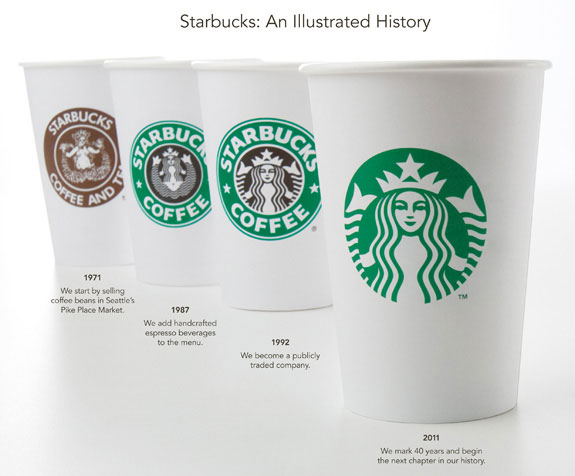
I think we can all agree that the Starbucks logo is iconic, and they have recently revealed an update to the globally-recognized popular logo. Perhaps they learned from seeing the Gap logo disaster of the fall – like Starbucks, the Gap logo was iconic, but the Gap made a major change that didn’t go over well. Starbucks, on the other hand, updated their logo in a simple way, maintaining the most recognized aspects of their global branding (color, shape, style, the “Siren”).
A sign of a great brand is one that stands alone without its name and people still know what it is. – Isaac Ashworth, Art Director, Ashworth Creative
As you can see above, the logo has progressed over the past 40 years. The recent change is simple and elegant.
Starbucks said, “From the start, we wanted to recognize and honor the important equities of the iconic Starbucks logo. So we broke down the four main parts of the mark – color, shape, typeface and the Siren. After hundreds of explorations, we found the answer in simplicity. Removing the words from the mark, bringing in the green, and taking the Siren out of her ring. For forty years she’s represented coffee, and now she is the star… The result is an evolved logo that celebrates the Siren in a much bolder way – it’s more expressive and energetic and still uses the same vibrant green circle that is so well recognized by our customers around the world.”
If you continue to read Starbucks’ comments on the redesign, you’ll see that despite the logo’s simplicity, a lot of effort was put in to perfecting the details, with the help of branding firm Lippincott. Still, the changes are unobtrusive. When you look at the new logo, you still see the brand you’ve come to be so familiar with. That’s an example of a truly skillfull logo redesign.

