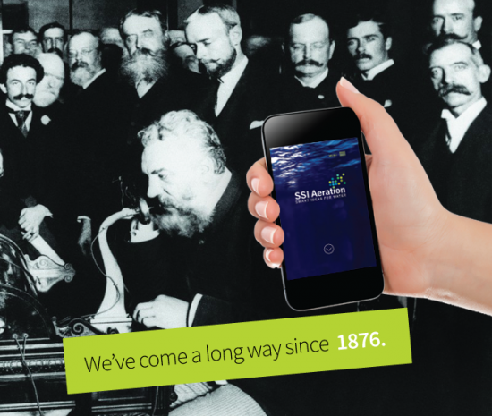
This week in March, 1876, Alexander Graham Bell received a patent for the telephone. That’s why this week we are tipping our imaginary hats to the brilliant inventor who changed modern life – and communications – for the better.
Which got us wondering, what would the brilliant Mr. Bell have made of today’s smartphones? At Ashworth Creative, we like to think that he would have been delighted by these portable, wireless computers and communications devices, not least because one of his inventions, the photophone, was very smart indeed. The photophone transmitted sound and conversation via a beam of light and was a precursor to the fiber-optic communication systems that achieved popular worldwide usage in the 1980s.
Like Alexander Graham Bell, we find phones very inspiring. Every week our team of smart designers and web wizards come up with exciting new ways to use them. Here are a few smartphone responsive sites we have created that may inspire you to give Eve Ashworth a call at 845-877-0410.
Getting Your Priorities Right
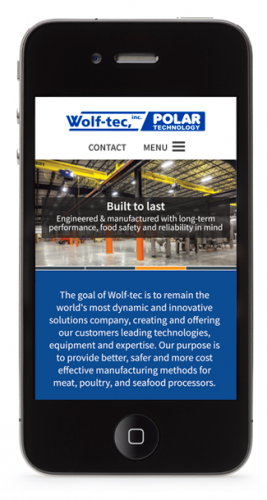
JBT Wolf-tec
When Ashworth embarks on a mobile site, we make sure we understand what information is most important to our client. For JBT Wolf-tec, a manufacturer of food processing equipment, they wanted to maintain their slide show of product benefits and to quickly guide the customer to the navigation points that met their priorities. Click here to visit the JBT Wolf-tec Website.
Giving an Edge to Ski and Snowboard Sales
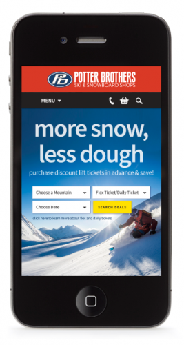
Potter Brothers
Potter Brothers sell and rent skis, boards, boots and gear as well as offering discount lift tickets in three states (NY, MA and VT) and online. So Ashworth designed their hardworking mobile responsive website need to be simple, smart, and ecommerce friendly. Click and see how easy it is for the customer to browse and shop on their phone, and then snap a shot on the slopes and share it on social media. Click here to visit the Potter Brothers Website.
In many product categories, 60% of consumer searches are done on mobile devices, primarily on smartphones. If your site doesn’t respond well; if it uses type that’s too small, or a layout that doesn’t work on a phone screen, you’re losing customers as well as reducing your search rankings. By developing a web presence that’s mobile responsive, you’ll be amazed how it can help your business grow. Alexander Graham Bell would want you to make the most of smartphone technology, and so do we at Ashworth Creative.