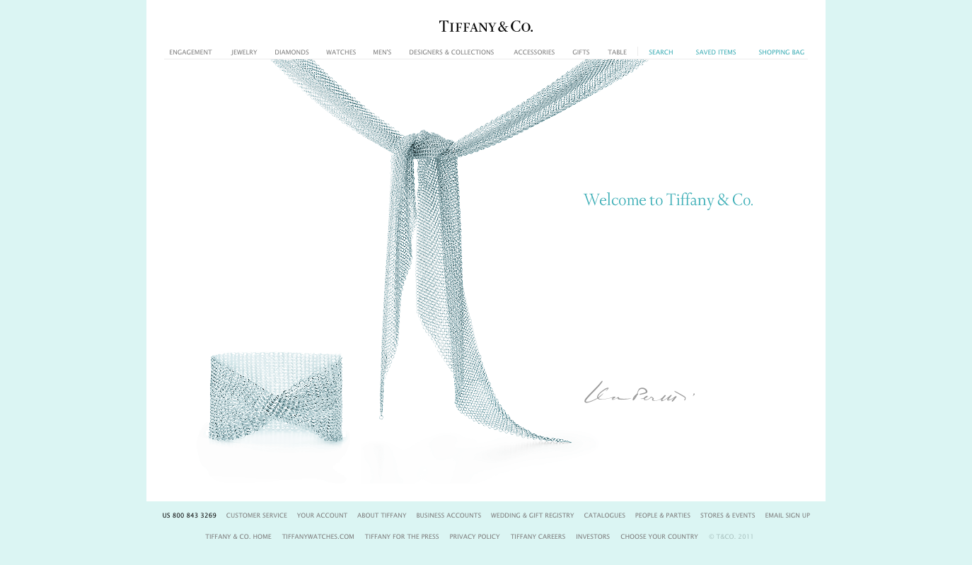
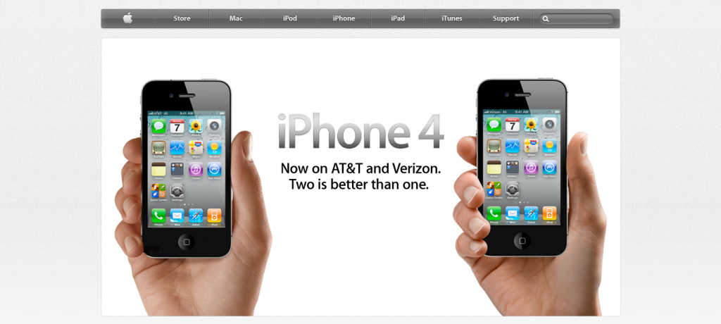
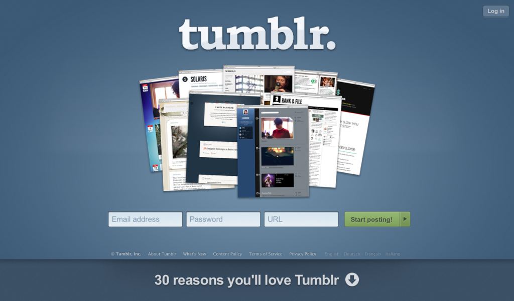
Negative space, that is… also referred to as white space, which plays a major role in design. White space isn’t always actually white in color, but it is defined as the space within a design that does not contain imagery or typography. Some examples of websites that make good use of white space are Tiffany & Co., Apple, Tumblr, and Google.
So, what’s the point of white space? As famed designer and typographer Jan Tschichold said, “White space is to be regarded as an active element, not a passive background.” White space isn’t merely blank, wasted, or unused, but it actually can enhance a design. Paul Boag recently wrote an interesting article in which he pointed out a few benefits of white space:
- Improved legibility – When text has room to breathe, and typographic elements aren’t running up against each other, legibility is greatly improved.
- Higher comprehension – As Boag shared, a research study conducted in 2004 revealed that white space around sections of text can actually increase comprehension.
- Increased attention – White space around a particular element can help to make it stand out, such as the iPhone 4 announcement in the Apple screenshot above or the search bar in the Google screenshot above.
- Creating a tone – The use of white space can create an impression of elegance, sophistication, and/or freshness. This clean look can set a particular tone for a brand, such as in the Tiffany & Co. screenshot above.
Again, white space doesn’t mean white in color, and it certainly doesn’t mean boring. Tumblr’s white space is a gradient blue, Apple’s includes both gray and white, and Tiffany & Co.’s is Tiffany blue and white. Even the white space on our own website isn’t white at all.
So, don’t be afraid of negative space – don’t try and cram everything you want your viewers to read “above the fold” of your homepage. Rather, utilize white space to grab their attention and appeal to their senses and they’ll be glad to scroll down and/or click through to find out more.
Remember, white space is nice space!*
*(via Paper Leaf)


