
The saying “you never get a second chance to make a first impression” (possibly coined by actor Will Rogers at the turn of the 20th century), remains true today, particularly when it comes to websites. Research from usability research company Taylor & Francis reveals that web users formulate their opinion about a webpage in a brutal 50 milliseconds. In plain English, that means instantly (the average human blink takes about 100 milliseconds, or 1/10th of a second).
But what happens after the blink? Good website design will help you pass the 50-millisecond test, but what comes next is equally important to ensuring visitors don’t bounce off your page or, worse, have such a bad digital experience that they don’t do business with you at all.
Good website experience is so important that, as of this month, Google will include it as a ranking factor. The announcement was posted to Google Search Central back in November. Google notes that page experience signals including load time, interactivity, visual stability, mobile friendliness, and safe browsing (among other things) will become part of their ranking criteria.
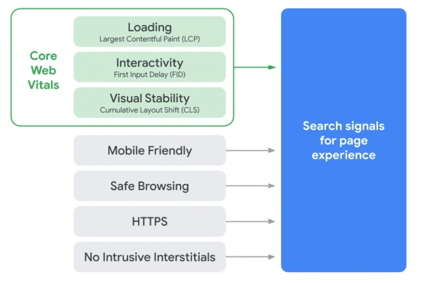
Source: Google Search Central
Writes Google: “At Google Search our mission is to help users find the most relevant and quality sites on the web. The goal with these updates is to highlight the best experiences and ensure that users can find the information they’re looking for. Our work is ongoing, which is why we plan to incorporate more page experience signals going forward and update them on a yearly basis.”
The consumer-focused website experience
Consumers are turning to digital channels more than ever before and their expectations are high when it comes to website usability. That said—a big part of user experience has to do with how a website looks. While that may seem superficial, statistics don’t lie (at least not 100% of the time).
Fully three quarters of people judge a website based on its aesthetics. People spend more time on website they find attractive, with one study finding that consumers would rather “hang out” on a well-designed (and beautiful) website versus a plain one. Again, this preference is connected to user experience (and perspective). But since beauty tends to be subjective, we think it’s helpful to list some best practices around good design that we implement with our clients’ websites.
Mobile friendliness: Your website should look slick on mobile devices. It should also load quickly and be easy to navigate from whatever screens or devices your customers are using. Optimize your images, use responsive design, and keep navigation uncluttered and intuitive. View your website on as many devices, browsers, and screen sizes as possible to ensure it looks good for as many users as possible.
Intuitive website architecture: Your website user journey should make sense. The information should be easy to find. Key sections like contact information, business location, departments, and main categories should be front and center. To this end, we recommend speaking to (or polling) customers to get a better understanding of how they use your website. What may seem intuitive to you, could represent a frustration or barrier to your customer. Designing with the customer in mind requires a deep understanding of the customer’s perspective.
Content accessibility/readability/scanability: A well-designed website contains text that’s easy to read, scan, and interpret using a screen-reader. Familiarize yourself with the US’s Section 508 guidelines for web designers, developers, and content managers. Section 508 addresses how people with disabilities use the web, provides guidance on web content accessibility, and provides in-depth information on universal design and accessibility approaches. Other content tips for readability include using strong headlines, breaking up content with subheaders, using bullets/numbered lists, and incorporating text enhancements (highlights, bold, italics, etc.)
Visual elements & design: Contrasting colors that make key visual elements stand out (and text easy to read), thoughtful use of images, crisp and professional photography, and high-quality video all contribute to a good first impression. When planning your website design, it’s helpful to understand user content preferences and trends for your industry. Images obviously play a much larger role for an ecommerce website versus B2B manufacturing websites. But regardless of industry or audience, optimizing images for website speed is crucial for good usability.
Content personalization: Websites that address different audiences should have clearly delineated sections that speak to each audience (e.g., healthcare professionals versus patients). This is an example of personalization in its most basic and straightforward form. 80% of retail customers expect personalized experiences when they’re shopping to the extent that they’re likely to abandon a retailer for a competitor based on a poor (e.g., not personalized) shopping experience. B2B buyers, having been trained in the art of personalization by B2C organizations like Amazon, are increasingly demanding personalized experiences throughout the buying journey up to and including the content they access on a company’s website. Much of this can be achieved using content automation and marketing tools that optimize the website experience for users, serving up the most appropriate content to a given user based on a variety of behavioral signals and other data.
The consumer digital journey involves more than your website
Mapping website user experience on your website is a process that considers the entire consumer journey—one that typically starts before a visitor reaches your website. Consider how complex the buying process is for B2B customers who visit multiple channels and connect with a variety of touchpoints as they gather information about a new solution or service.
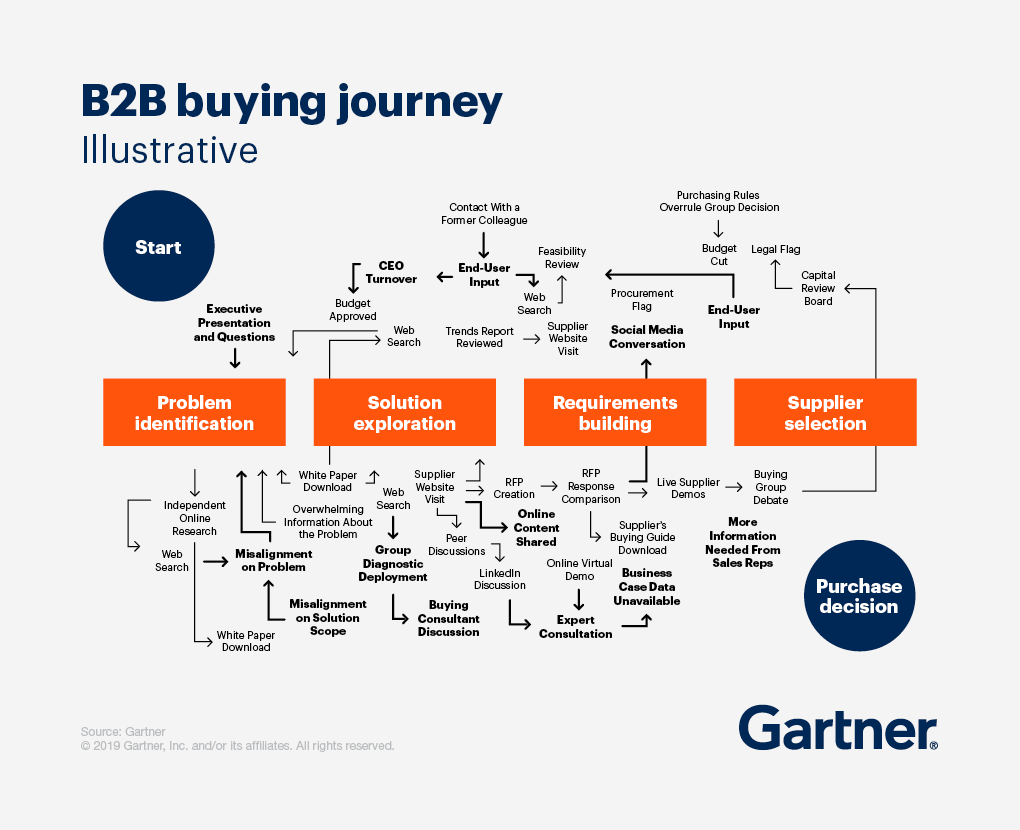
Gartner’s B2B buying journey
Gartner illustrates how the complex B2B buying journey circles through a variety of channels including social media, supplier websites, peer discussions, virtual demos, and independent web research in a process that moves from problem identification to purchase decision. Throughout this process, buyers will continue returning to the supplier website to download information, schedule a demo, and ultimately reach out to a sales rep.
The journey may look quite different from a B2C perspective, but the principal of good user experience design is the same—start with the consumer. For example, if you’re a local grocery store chain, then consider how shoppers use your website to make their in-store experience easier.
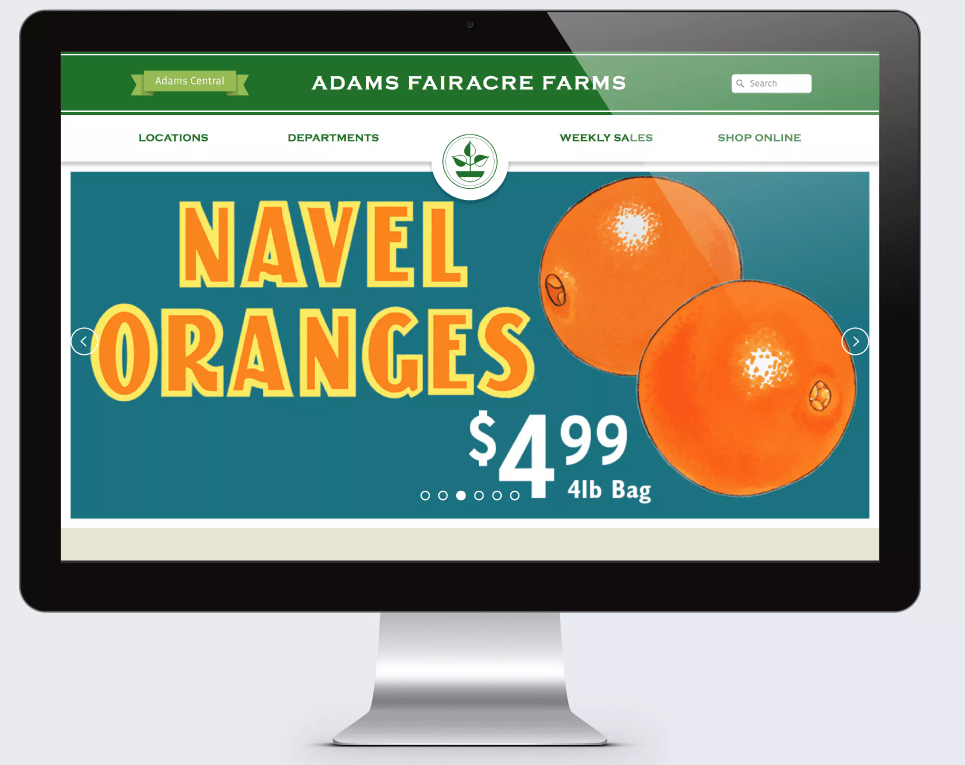
Shown above, the home page of local supermarket chain Adams Fairacre Farms employs a simple, straightforward design to communicate the essential information shoppers need. We used the brand’s well-known design style including their colors and fonts to provide brand consistency for local shoppers familiar with Adams. The design also successfully communicates the brand look and feel to new customers who may be planning a visit but haven’t yet been to a physical store.
An effective website user journey must consider the user’s perspective at every stage of the design process. That’s the best way to ensure you provide the right information to the right user at the right time (the definition of a good user experience). If you keep the user’s needs top-of-mind during the planning and mapping phase of website development, you’ll be in a much better position to deliver a top-notch user experience (and a great first impression), regardless of who your audience is.
—
Contact us to discuss how we can help you create a user-focused website that puts the customer first.