
An effective marketing agency should act as a partner, helping clients streamline marketing initiatives and plan effective strategies for growth. Even so, it’s not always easy for agencies to communicate value to clients.
This is a big reason why agency churn rate is so high—ranging from 28% to 50% or more, depending on pricing and service category.
It costs much more to onboard a client than to retain an existing client, so agencies have a vested interest in reducing churn rate by keeping clients informed and happy.
One way to do this is to clearly demonstrate value.
Most agencies do this by providing regular reports, but dumping lots of data on a client can be counterproductive, particularly when you’re spending more time creating reports than getting the real work of marketing done.
Add to this that C-Level executives, VP’s, and overworked marketing managers often don’t look at reports because they simply don’t have the time to sift through them.
That’s where data visualization—and simplicity—come in.
In this post, we’ll review how agencies (or marketing departments) can demonstrate the success of their various digital marketing initiatives with a few simple charts.
The pain of communicating value
How does an agency or marketing manager communicate the value of an online campaign? The answer to this question isn’t as straightforward as it seems.
While it’s fairly easy to track sales and revenue, it can be difficult for companies with long sales cycles to successfully attribute the source of their sales and leads, particularly when closing a sale takes two or three months or longer.
It can also be tricky to communicate success when you’re reporting on something difficult to measure such as brand awareness. That’s why it’s important to establish goals before you ever place your first ad or create your first piece of content.
First things first—establish goals
The best way to demonstrate the value of any initiative is to have measurable goals. Here are some examples of what we mean by that:
Soft Goals (brand awareness/lift)
-
-
-
-
- Website visits
- User engagement: bounce rate, time on site, pages per visitor
- Social media growth (likes, comments, shares)
-
-
-
Hard goals (actions/conversions)
-
-
-
-
- Sales
- Revenue
- Form Leads
- Newsletter signups
- Phone calls
- Appointments booked
- Subscriptions
-
-
-
All the above goals (including the soft goals) can be tracked or measured in some way. Your first step is to work with your client or manager to establish realistic goals. The next step is to record some benchmarks (if possible) so you can compare the impact of your marketing initiative(s) to a baseline.
For example, maybe you’re getting one or two leads per month and you want to increase that to 1 or 2 per week. That’s an easy goal to measure.
Enough preamble, here are those charts we promised you!
Chart #1—The most important data first
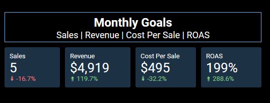
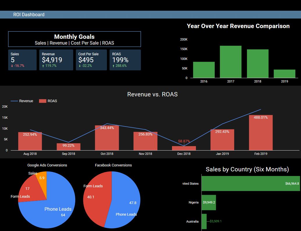
Simplicity is key when it comes to communicating performance for a campaign. Though every client is different, all initiatives should have clear, measurable goals and these goals should be front and center in your 3-minute ROI report.
The above table (taken from Google Data Studio) shows the four metrics that this client really cares about—sales, revenue, cost per sale, and return on ad spend (ROAS).
The percentages beneath each metric represent the change compared with the previous time period (in this case January versus February). Google Data Studio makes it easy to change this comparison to a year over year or a custom date range.
Chart #2—Performance over time
Reporting on performance over time—weeks, months, and even years—is an excellent way to establish benchmarks and get a bird’s eye view of performance.
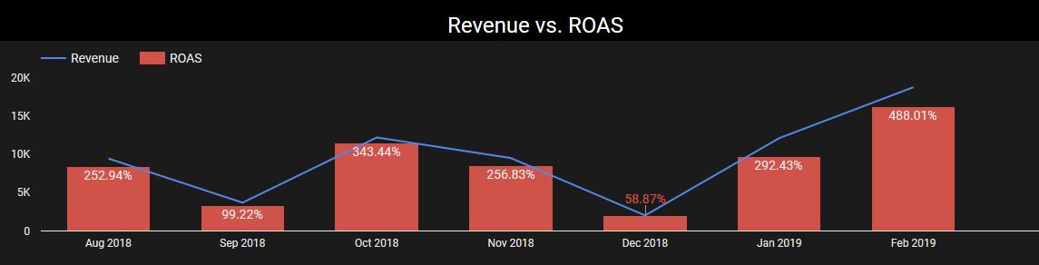
The above chart shows month over month revenue (the blue line) and ROAS over the course of seven months. Include one or two relevant metrics based on your goals (for example, maybe you’re more interested in user engagement so you could substitute Revenue and ROAS with total users and time on site.
Here is another version of the performance over time—a year over year revenue comparison (2019 is through February).
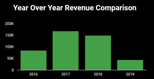
Chart #3—Breakdown of conversions by type
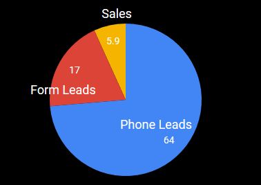
Since most campaigns have more than one goal, it can be helpful to provide a breakdown of conversions by type. Once again, simplicity is key here. A pie chart that shows the conversion count is enough to clearly communicate how a campaign performed for a given time period.
If you’re running multiple campaigns (e.g., ads on Facebook and Google), you can clone this pie chart and show the conversion breakdown by campaign source as follows.
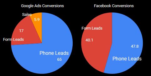
Chart #4—Revenue by Segment
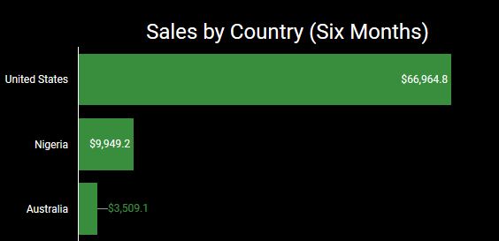
Revenue by segment is good way to summarize the most important segments for a given campaign. In the case of the above chart, revenue is broken down by country because the client is running both US and worldwide campaigns.
Depending on the client, the segment may change. For example, you can break revenue down by keyword, device or day of the week. Reviewing which segments drive the most revenue or conversions can help you decide where to focus funds for the coming quarter or year.
It can also reveal opportunities that the client didn’t realize were there (e.g., targeting more ads to Nigeria). This is a great way to offer value to clients.
The big reveal
Here is what a one-page dashboard might look when it incorporates all the above charts.
Tools we love
Here are a few of the tools we use to provide the recommended charts and the data behind them.
- Google Analytics—Google’s free analytics tool tracks and reports website traffic. As of January 2019, Google Analytics comprised more than 85% of the global web analytics market. We use it for all our clients’ websites because it seamlessly integrates with a variety of platforms and tools.
- Google Data Studio—Another free tool from Google, Data Studio is a dashboard reporting tool that pulls data directly from multiple platforms such as Google Ads, Google Analytics, and Google Docs to create robust, customized reports.

- Call Tracking Metrics—This web-based call-tracking tool makes it easy to implement tracking numbers for all your marketing initiatives. It integrates with Google Analytics so that you can set up calls as “goals” which enable you to measure leads from online and offline sources.
Conclusion
Reporting campaign results is a necessary part of working with clients, but it doesn’t have to be painful. Keep your reports simple and focused on the most important goals so you can demonstrate the value of your initiatives without overloading your client with too much data.