As a branding and web design firm, we can sometimes be presented with unusual client challenges, and we love that! We enjoy attempting to find solutions to unique problems.
In this blog, we are going to take you through a design case study for our client Westchester Community College.
We were tasked with conducting both a refresh of their branding and a redesign of their website. The website component had some significant constraints, but we found an innovative way to solve them.
A Fresh Start
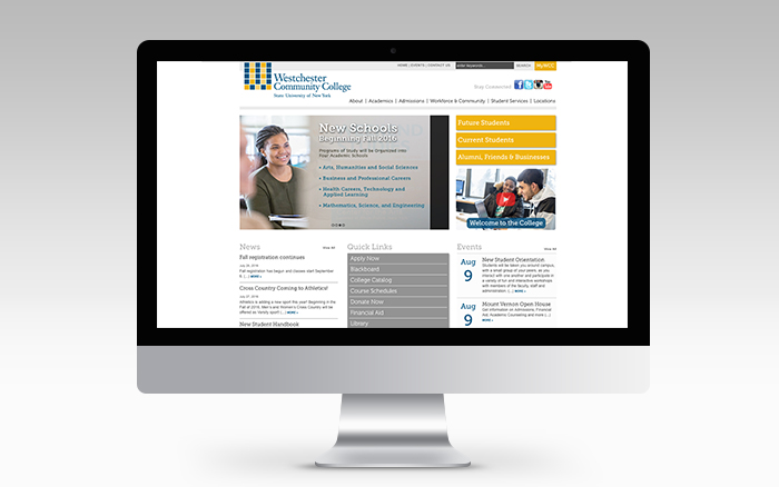
Original Design
Westchester Community College, a State University of New York, were seeking to create an identity that was uniquely theirs and felt that the arrival of a new president of the college was an ideal moment to refresh their identity and make it more consistent. Though they had a logo, their color palette and font system were not instantly recognizable as their own. .
When we met with them, they laid out all the brochures, flyers and collateral that various departments had designed. Seeing them next to each other, it was clear that the pieces looked completely unrelated in design.
Their website had even more complex problems. A mishmash of different fonts, colors, and layouts made the user experience confusing. Additionally, they were not using a content management system that enabled different stakeholders and departments to incorporate new content.
But the biggest hurdle was the fact that though the redesign would require a whole fresh look for a huge site with many pages; this community college did not have the budget for a contractor to rebuild every single page.
The institution was at a crossroads with President about to take control and we were delighted to be a part of their exciting transition!
Diving into Design
Besides loving a good challenge, we especially like it when we can say “We improved what they had…dramatically.”
We started the branding process by choosing a font family that had several different weights. Source Sans Pro comes in light, extra light, regular, medium, bold, semi-bold, heavy and black. It is available with all the italic versions as well. We chose a font system like this because we knew it would allow us to be consistent and uniform with both the web and print. We wanted to make everything feel holistic and connected.
Next, we showed them the benefits of moving their website to a content management system such as WordPress to make the job of adding new content go much smoother.
Finding Workable Workarounds
With a limited budget, we knew that it was essential for us to figure how to design the site in such a way that the existing content (and in particular, the creative assets) could flow into the new WordPress framework without our touching them.
In other words, it had to be built in a way manner that would allow the sizes of the images that were already on the old website to look good in the new one without our having to go through the time-consuming exercise of resizing every single image in the library.
Additionally, their HTML tags dictating font sizes would need to work within our new design.
Getting Under the Hood
There were many questions to answer: When we swap the current header font for our new one will it look good? If an image is 500 pixels wide in the existing site, will it still look right at 500 pixels wide in our new redesign? Etc.
Without the time – and budget – to go through and change original content and code, we had to set design rules so each page would transition smoothly into the new layout without the need for individually tweaking hundreds of pages.
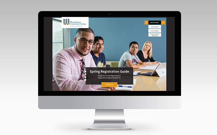
Discovering Solutions
Updated Design
While brainstorming on how we could make the important information in various areas of the site stand out, we came up with a series of ten design templates. The templates were different page styles that not only took into consideration the layout of the old site but also provided the new one with some variety so it wouldn’t look as though every page was the same.
When we showed the college the initial design of how the content would look in our new framework, they loved it! They were especially pleased that they would be saving money by finding a way to avoid going through and editing every single page. They appreciated the way we dealt with all of the challenges.
Feedback from the Client
The look of the redesign was well organized. The colors work well together, and most importantly the web presence looks like their print material. The client loved the new navigation and found our WordPress theme easy to work with for updating current pages and adding new content.
“Please allow me this opportunity to thank you all for the successful launch of the new website. The site looks outstanding, and the Ashworth team did a seamless job getting everything up and running. Thanks again for being a true dream team” – Craig Fischer, Publications Manager, Westchester Community College
2 Responses to Rebranding and Website Redesign – Case Study
Your website is the first impression you make on a user and the last you leave. It will either provide an intuitive experience or a frustrating one. It has the power to either engage prospects or deter them, inviting them to make a purchase or encouraging them to seek out a competitor instead. This is why hiring professionals is key. this are all great examples of good design.
Exactly, our goal is a user-friendly, cohesive design that makes sense for the client and the audience. A site should not only look great, but have intuitive functionality as well.